Xótica: Cultural Magazine

Interactive editorial design and visual narrative exploration

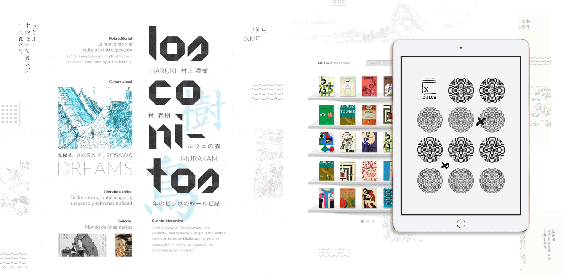
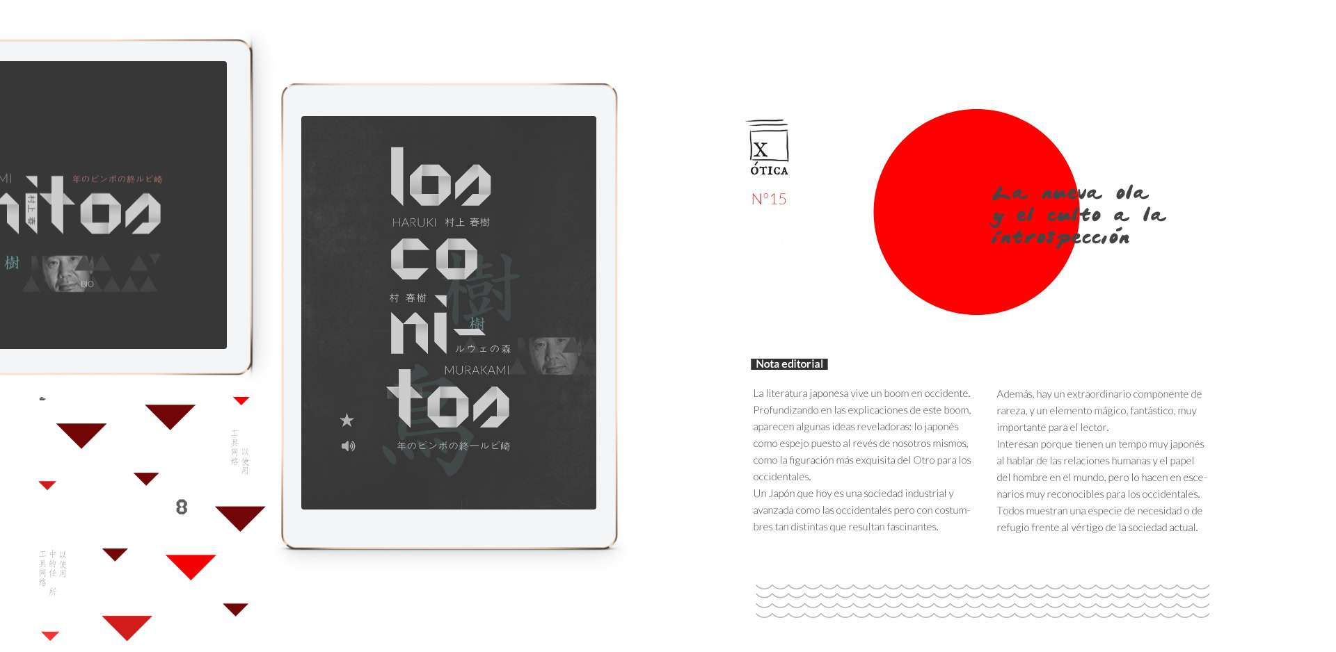
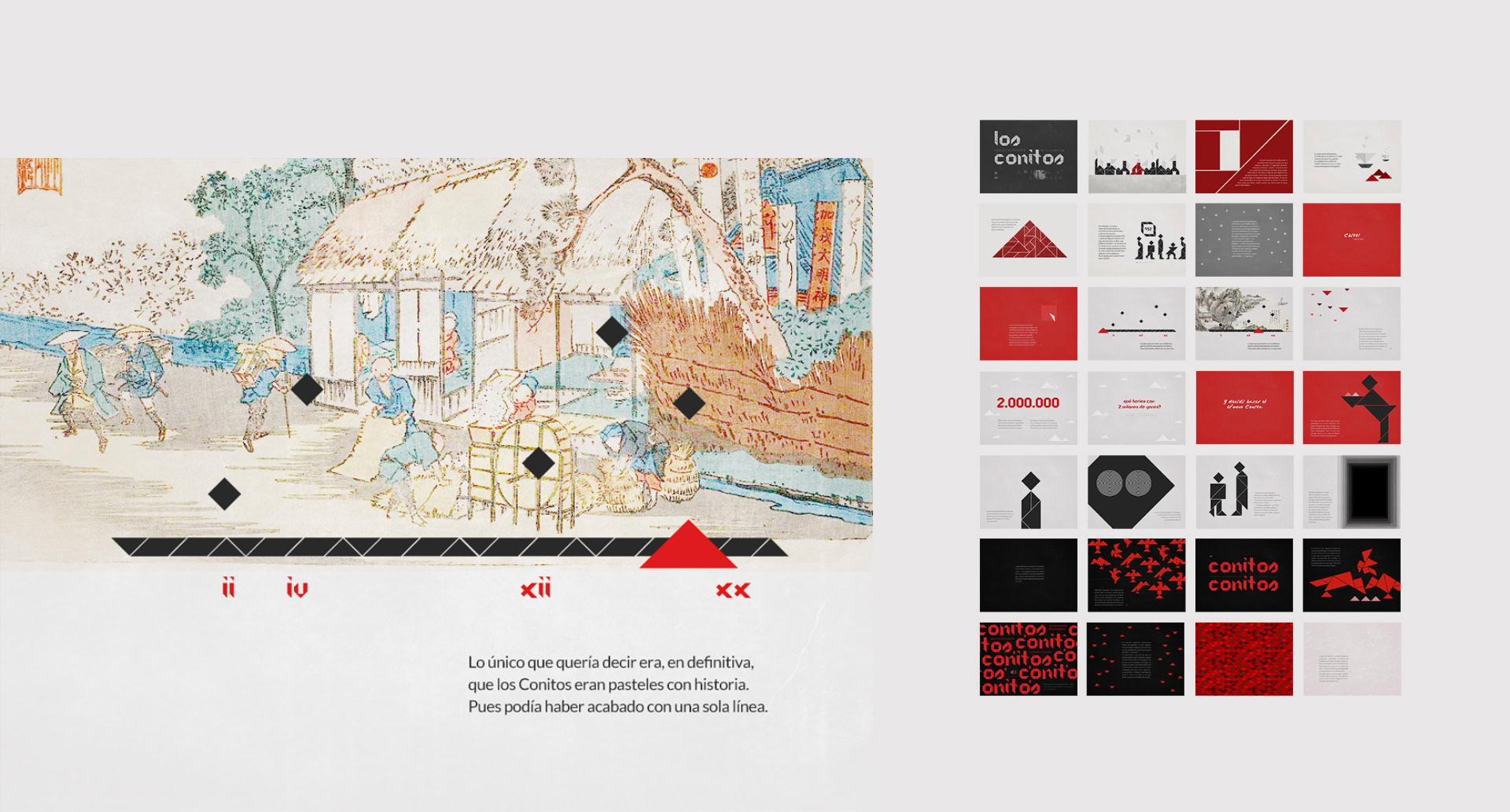
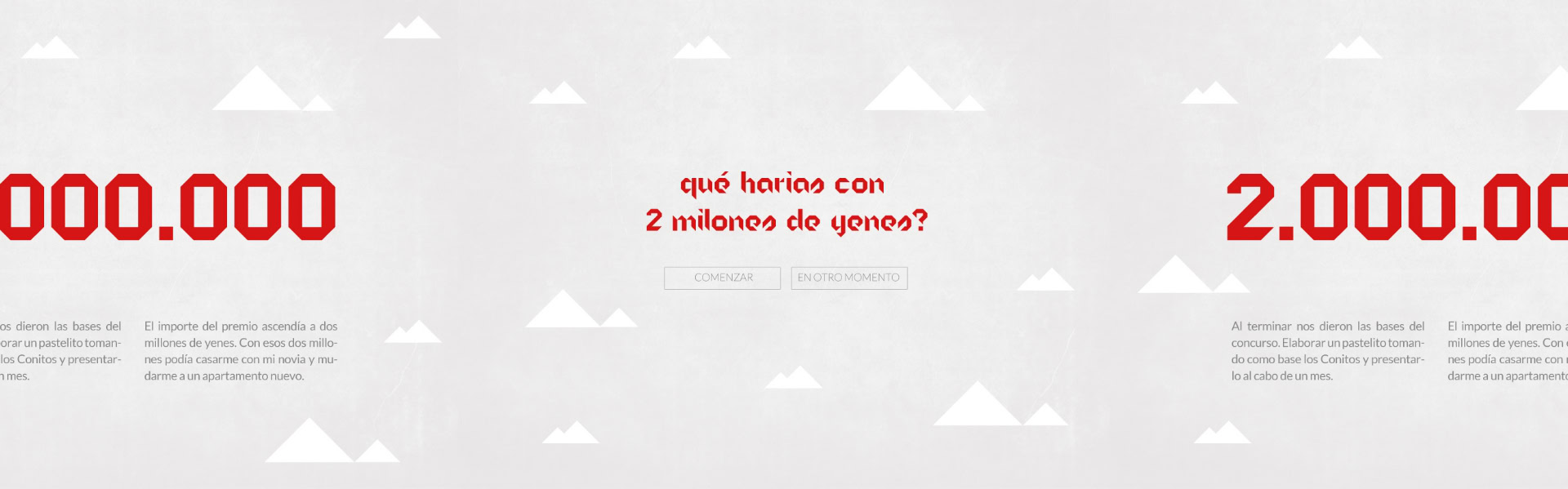
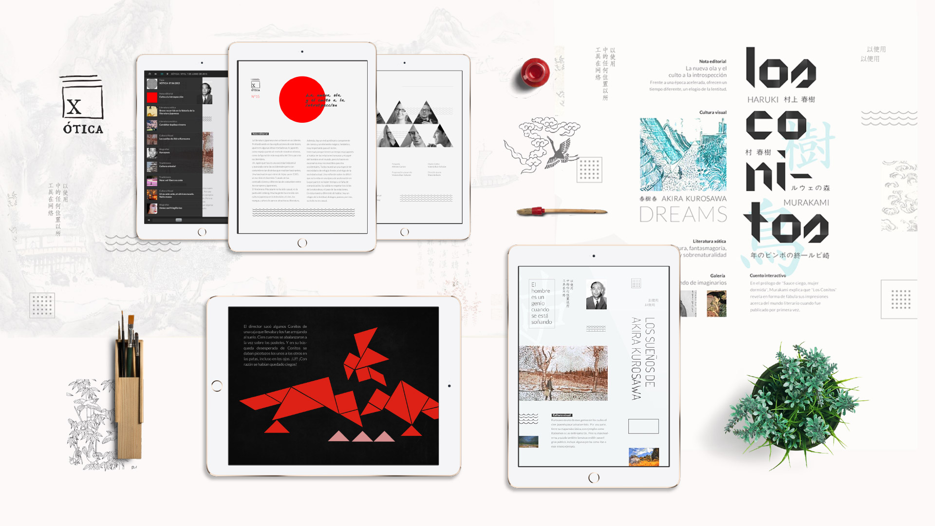
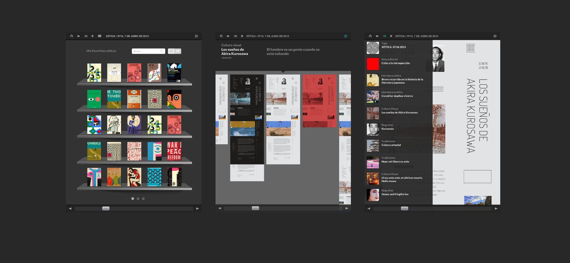
Xótica was born as an avant-garde exercise in digital publication design. The project’s goal was to explore the possibilities of interactivity applied to literature, creating a platform where graphics and navigation adapt to the cultural identity of each issue. In this edition, the focus was Japanese culture, centered around one of Haruki Murakami’s short stories.

The interactive tale: “Little Cones”

The core of this issue is the visual adaptation of Murakami’s “Little Cones”. Moving away from passive reading, we designed an experience where illustration and visual rhythm accompany the dreamlike and fantastic atmosphere of the fable.

The challenge was to translate the author’s impressions of the literary world into a series of interactions that guide the reader through the story. Through a playful treatment of the elements —including the iconic talking crows— the design acts as a mediator that deepens the immersive experience of the text.

Editorial Navigation Standards

For the structure of Xótica, we adopted the navigation patterns established by global leaders in the digital publishing industry, such as Wired or The New York Times. We implemented a dual-axis reading architecture: horizontal progression for navigating between articles and vertical scrolling for deep-diving into the content of each piece.

This logic, combined with specific iconography for reading progress and favorites, ensures a user experience that is familiar yet enriched by the visual uniqueness of each installment.

Related projects