Healthy Glow Coaching

Business strategy and identity —transforming a personal vision into an authority brand

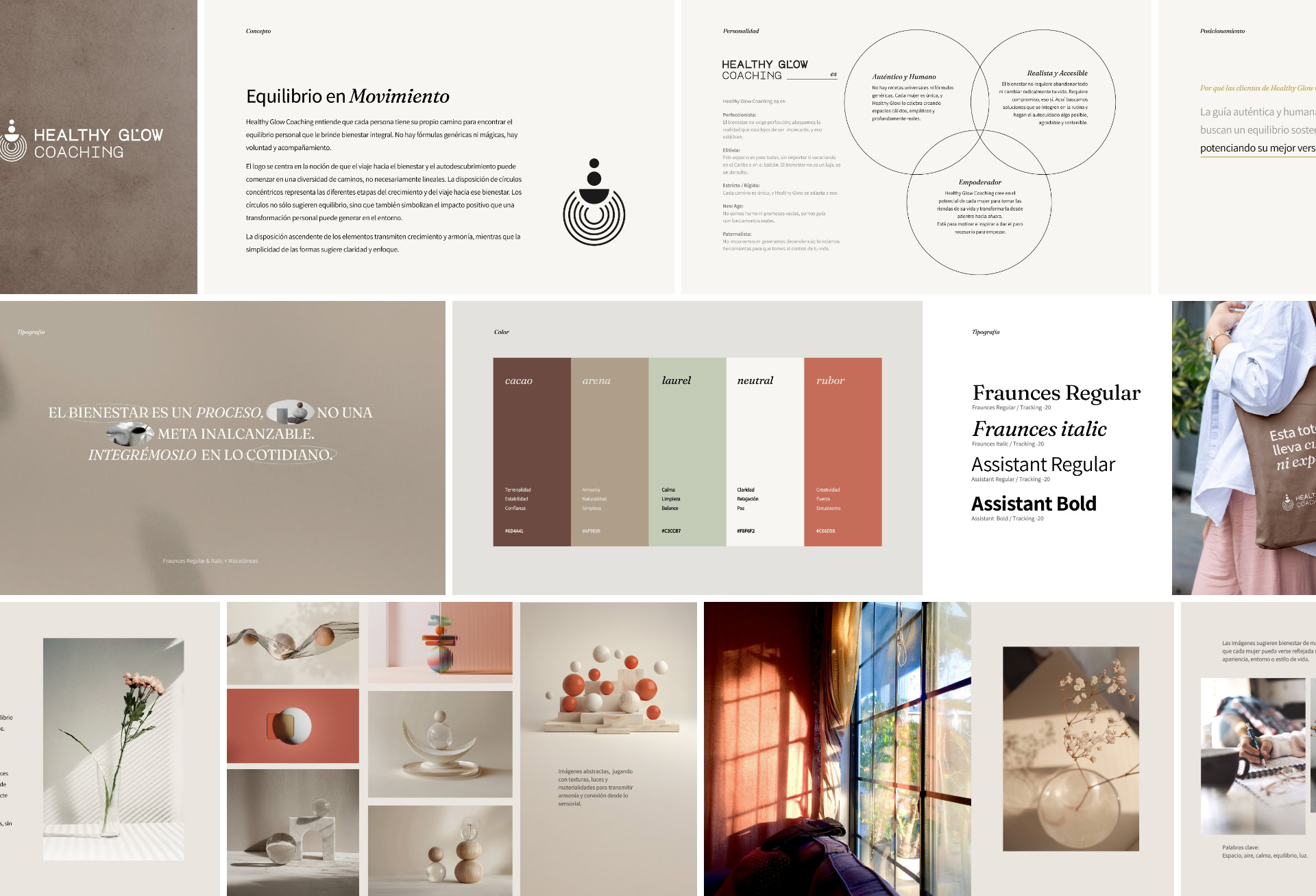
Celeste came to 6vStudio with a clear idea but a diffuse structure. As is often the case with projects in their early stages, the starting point was a simple brief that needed to be decoded. Our work began by bringing clarity: we listened, analyzed, and shaped her initial business model to build on solid foundations.

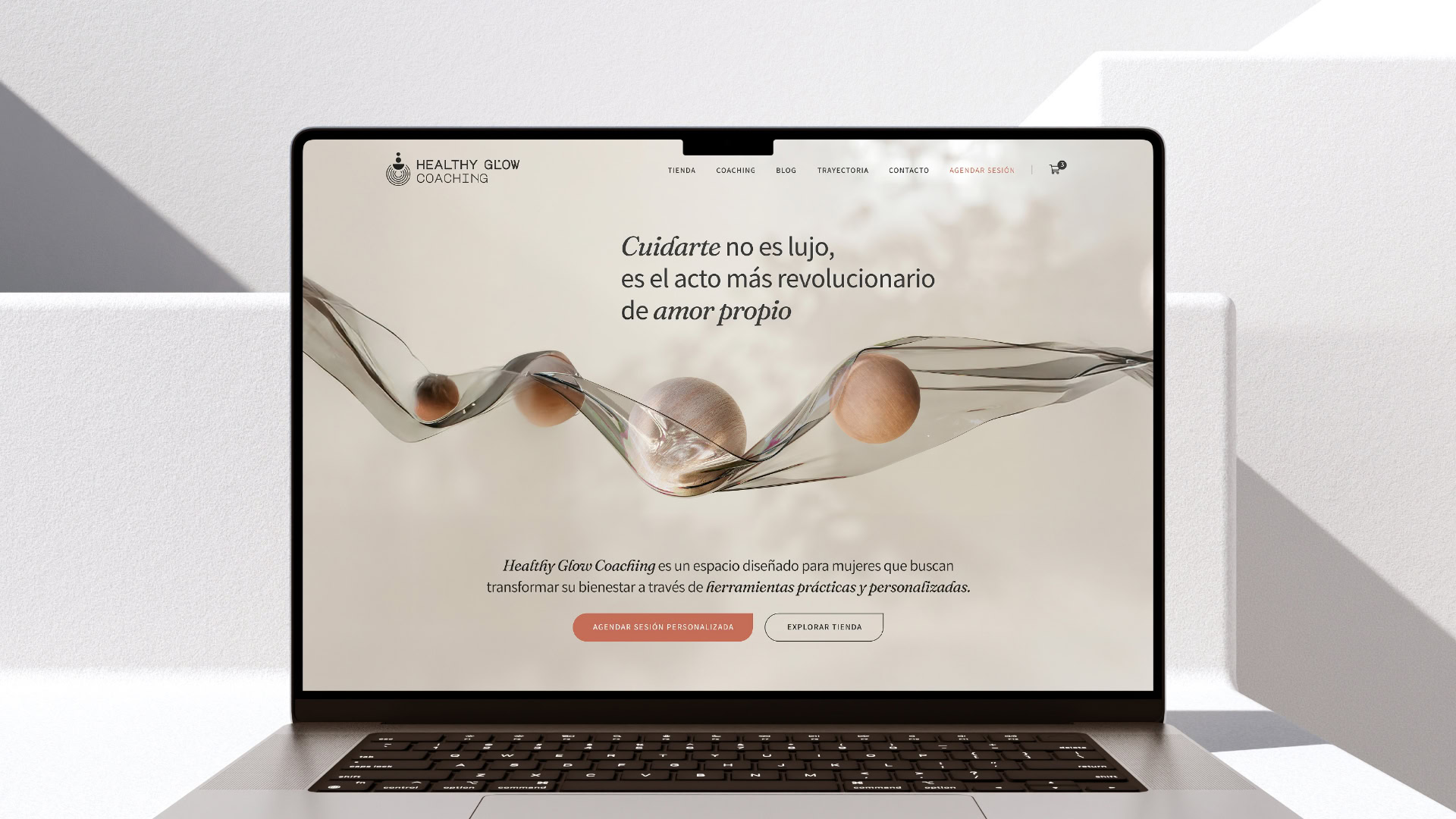
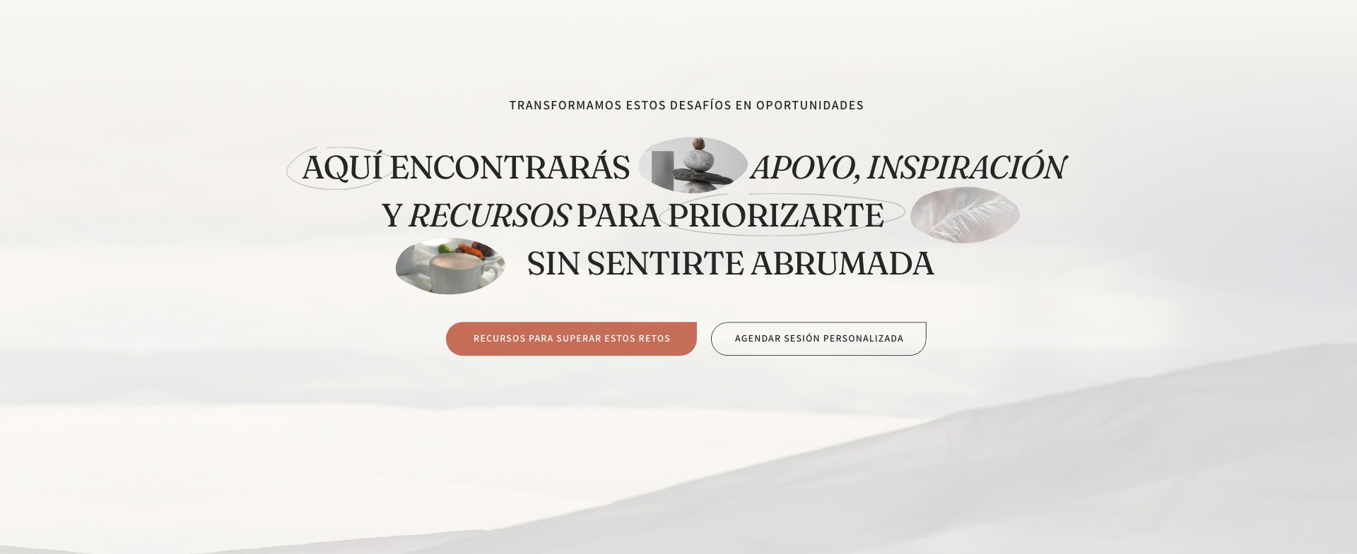
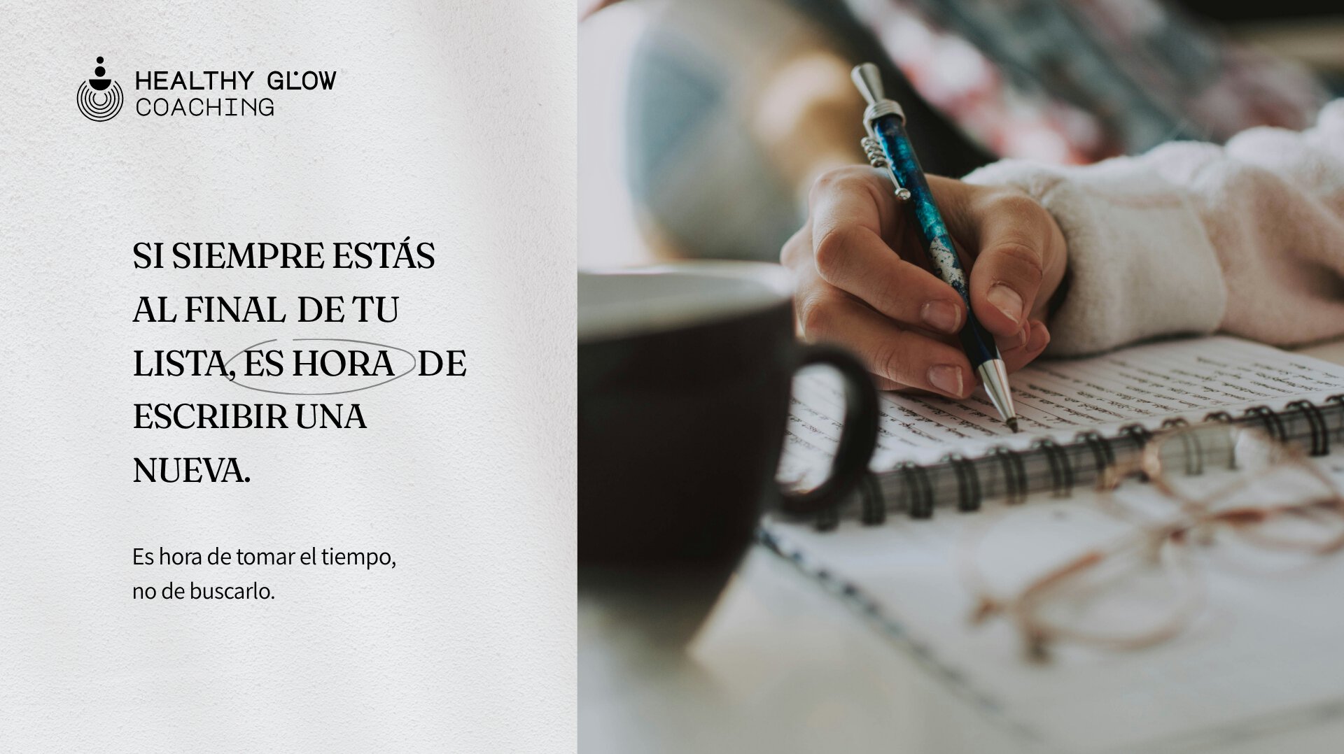
We supported Healthy Glow Coaching through an end-to-end process, from brand architecture to a web experience that balances human warmth with professional excellence. We didn’t just design an interface; we built the visual system, the narrative, and the functional structure that allowed Celeste to move from an incipient idea to a clear, scalable value proposition with a real impact on her integrative wellness community.

Brand Architecture

For Healthy Glow Coaching to work, we first needed to define its soul. We worked on a comprehensive brand architecture that transformed Celeste’s ideas into a solid manifesto and a clear purpose: empowering women to reclaim sovereignty over their own well-being.

We took on the full development of the brand’s copywriting and narrative, structuring every pillar—from positioning to value proposition—under a guiding premise: self-care is not a luxury, but an act of strength. Having this firm strategic foundation allowed us to move toward the visual identity with absolute clarity on what we wanted to communicate and who we were speaking to.

Building an Atmosphere: Visual Identity & Art Direction

Beyond the logo, the hallmark of this identity lies in the visual atmosphere we created. Rather than imposing a rigid aesthetic, we aimed to suggest a state of calm and balance through precise art direction based on light and space.

We developed a photographic criteria that avoids clichés and the infantilization of the message, prioritizing imagery that allows every woman to project her own experience. The inclusion of abstract photography—playing with textures and materiality—reinforces the brand’s sensory dimension. The result is a system where harmony is felt before the first word is read.

The logo integrates naturally into this universe, focusing on the idea that the journey toward well-being is not linear. We designed a layout of concentric circles representing the stages of self-discovery and the impact of personal transformation. The ascending structure conveys growth and harmony, maintaining the simplicity needed to project clarity and focus.

From Strategy to a Functional Tool

We believe a brand’s identity is truly solidified in its real-world applications. Once the central concept and logo were defined, we moved directly into platform design; this allowed us to refine the visual mood, typography, and color palette within a concrete interface before finalizing the brand manual.

We designed an information architecture where various service verticals (1:1 sessions, ebooks, guides, and free content) coexist harmoniously without overwhelming the user. We wrote every section using a warm, human tone to connect with users, creating an ecosystem where the art direction’s softness meets a solid technical structure in WordPress and WooCommerce.

The result is a platform designed for the Healthy Glow Coaching team to manage their growth with total autonomy. Thus, the project not only communicates its purpose but also provides an operating system capable of processing sales and services efficiently from day one.

Related projects