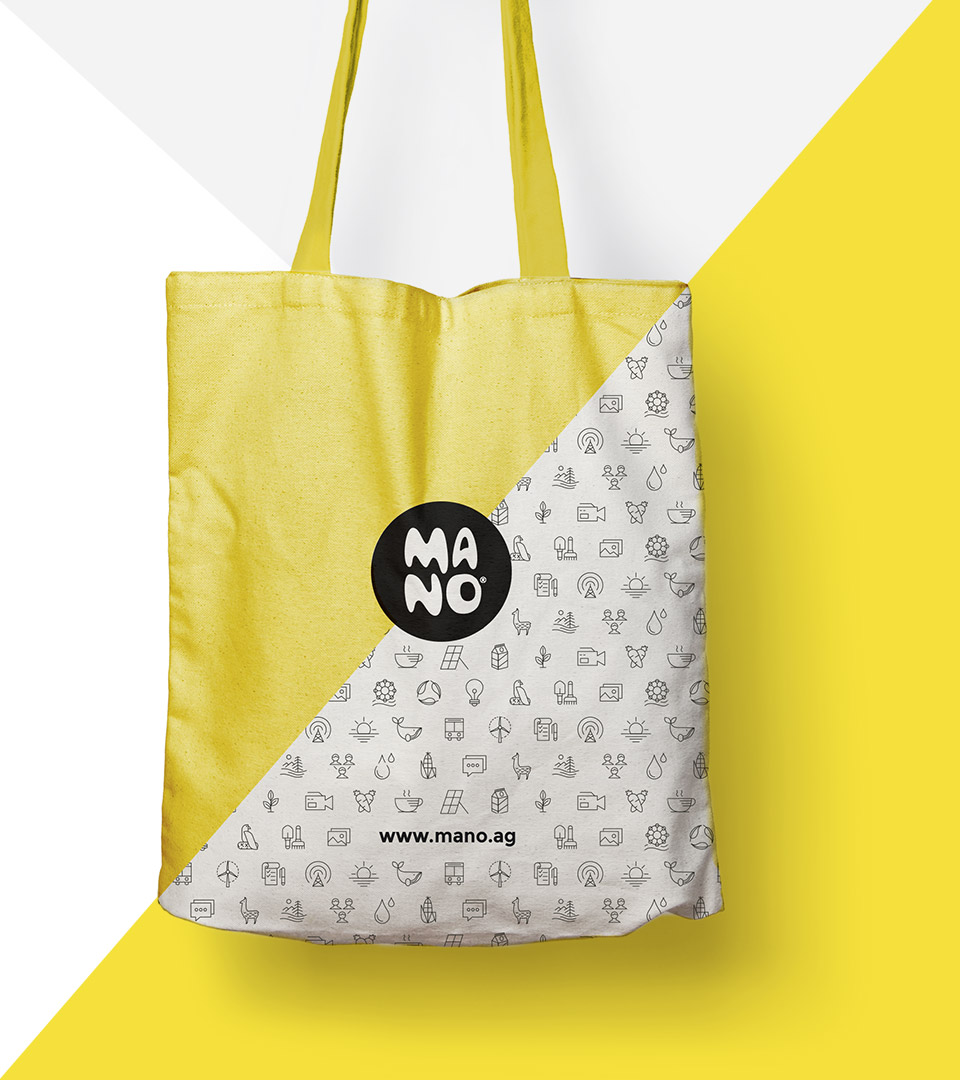
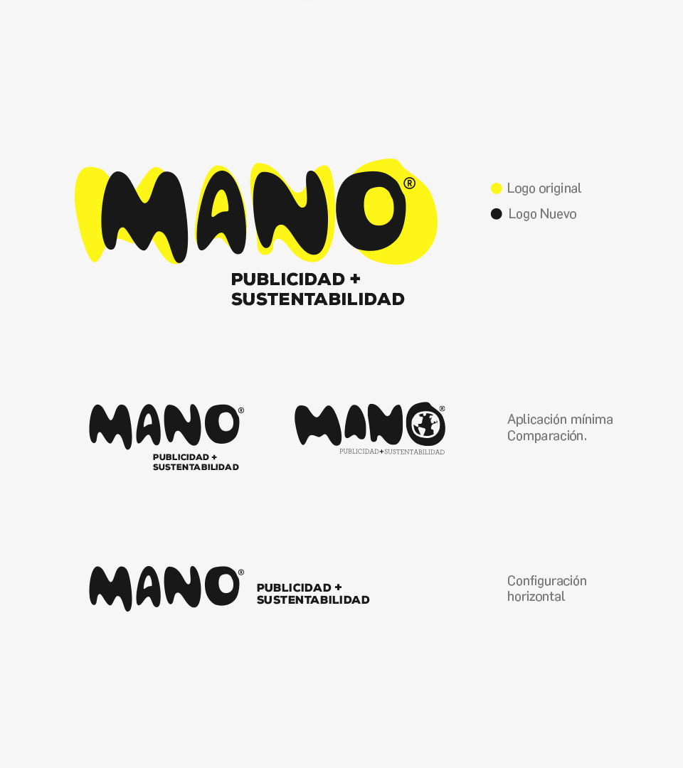
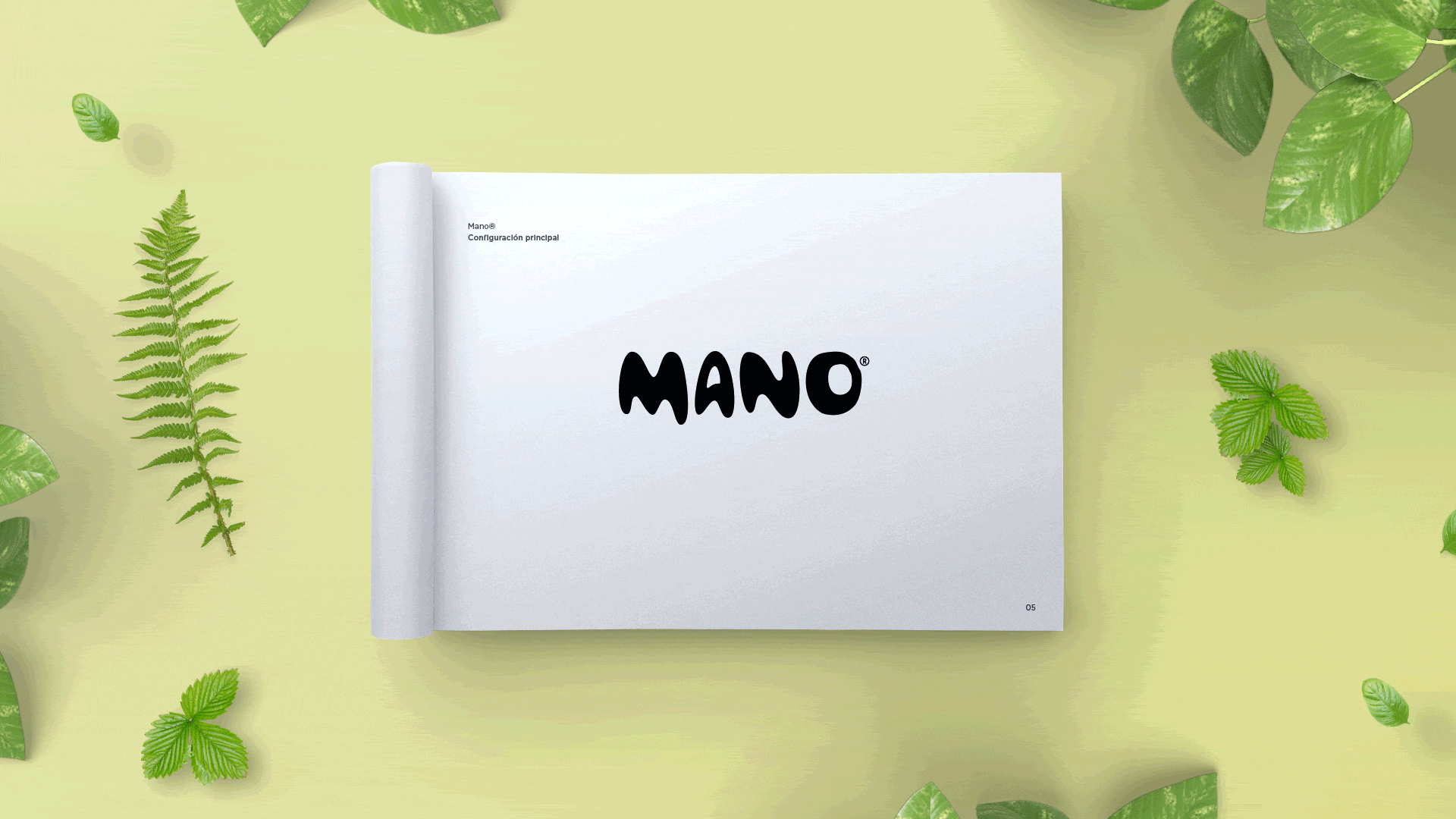
Mano

Mano is an agency specializing in sustainability, corporate social responsibility (CSR) and green & social marketing.

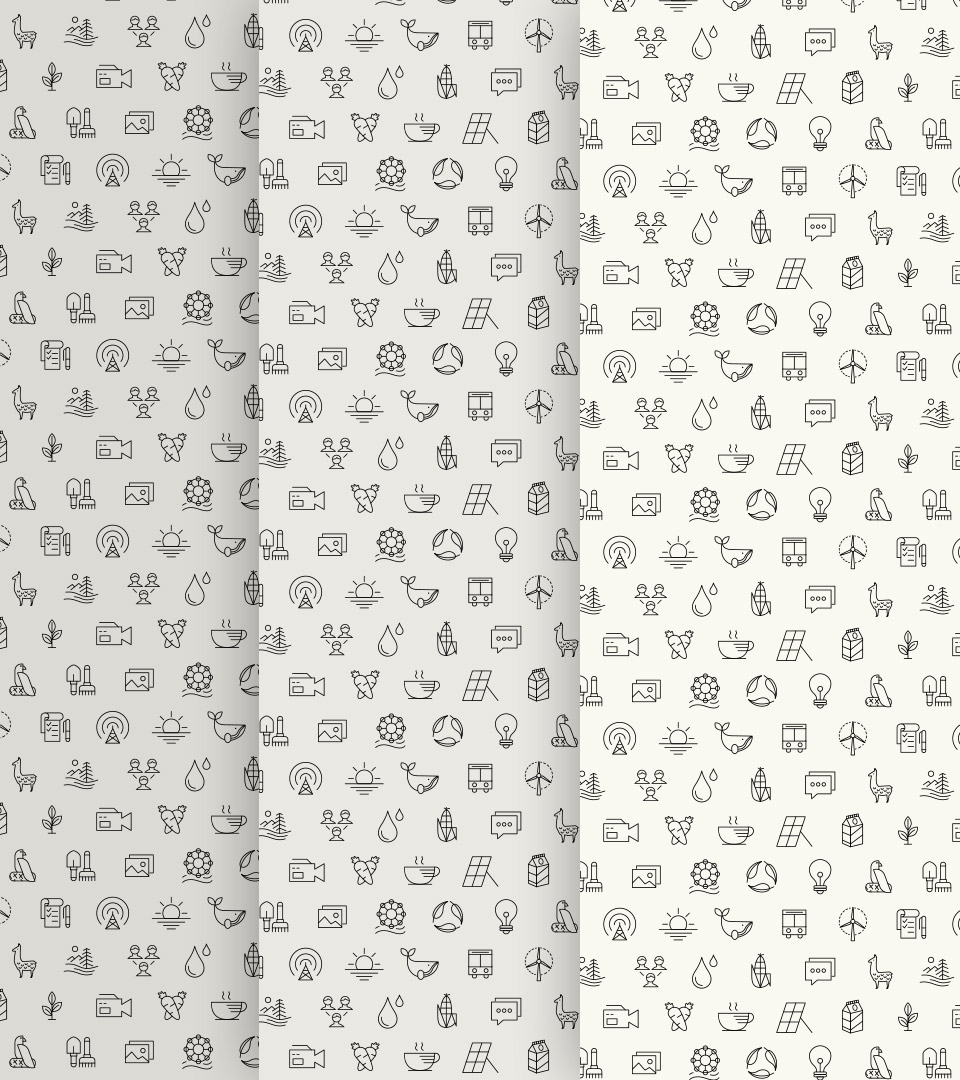
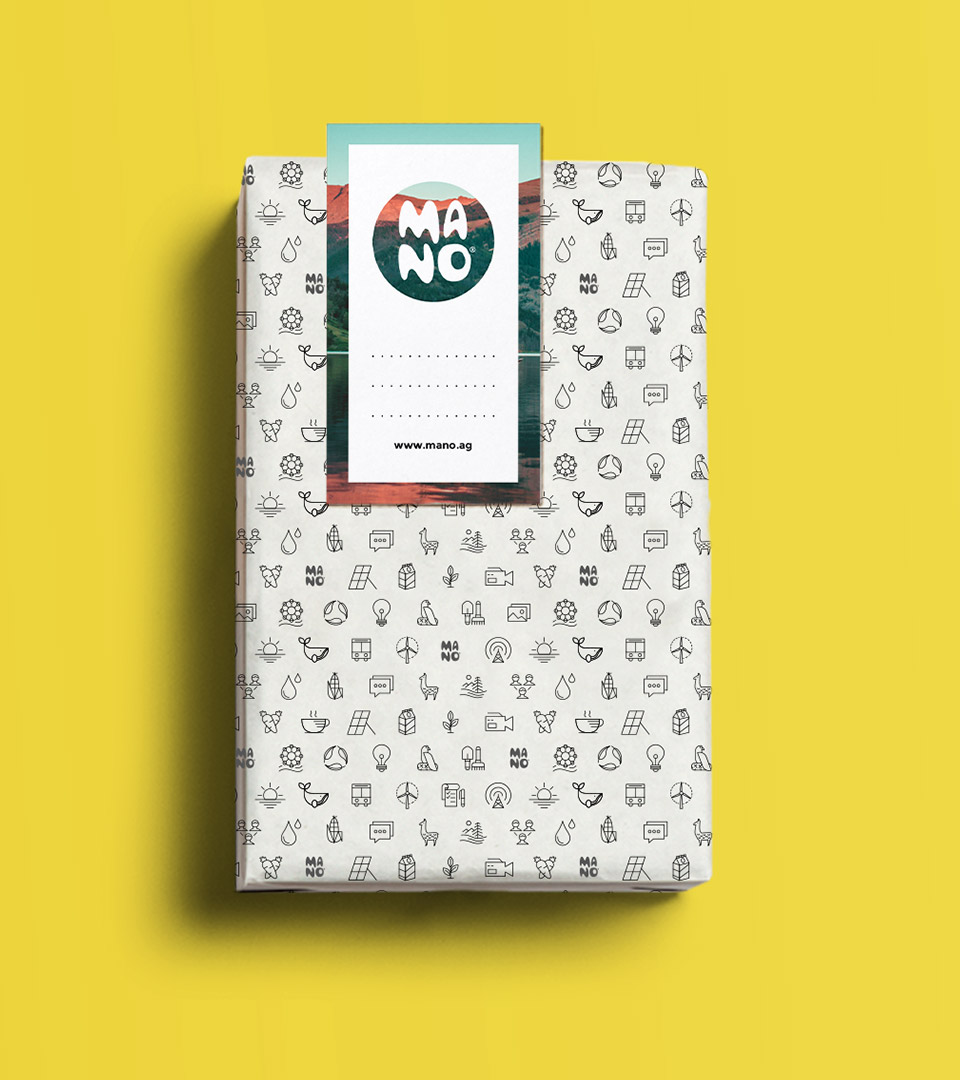
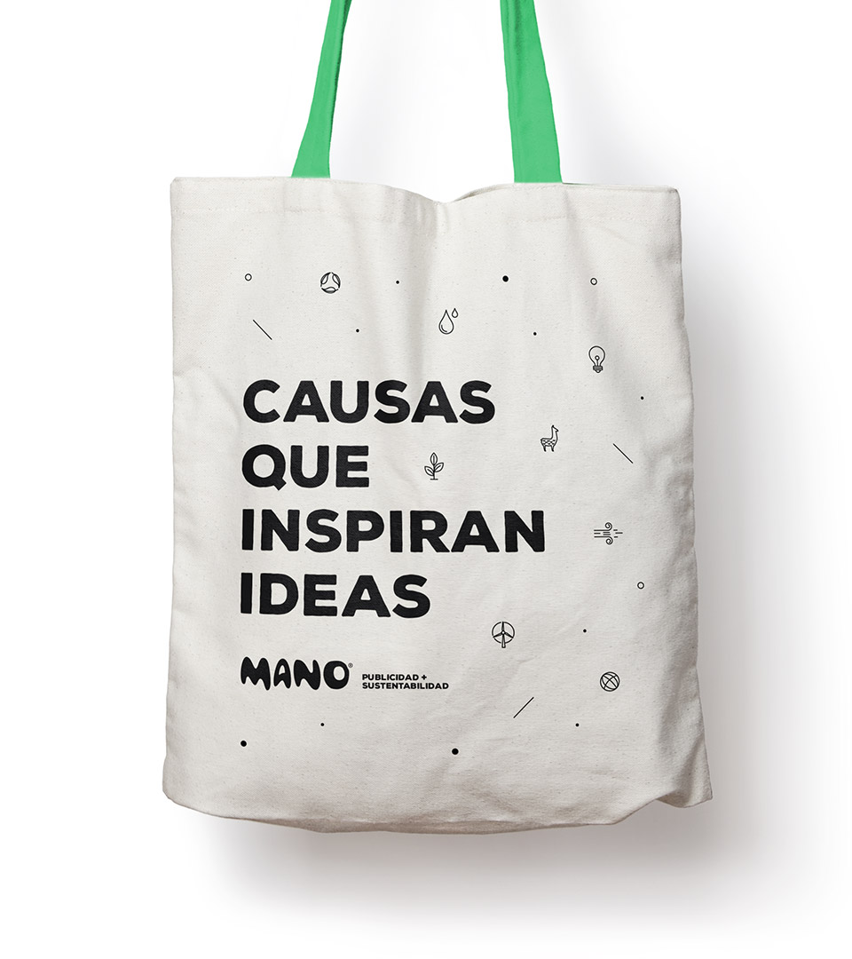
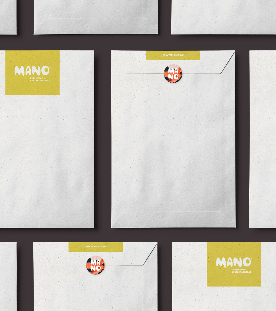
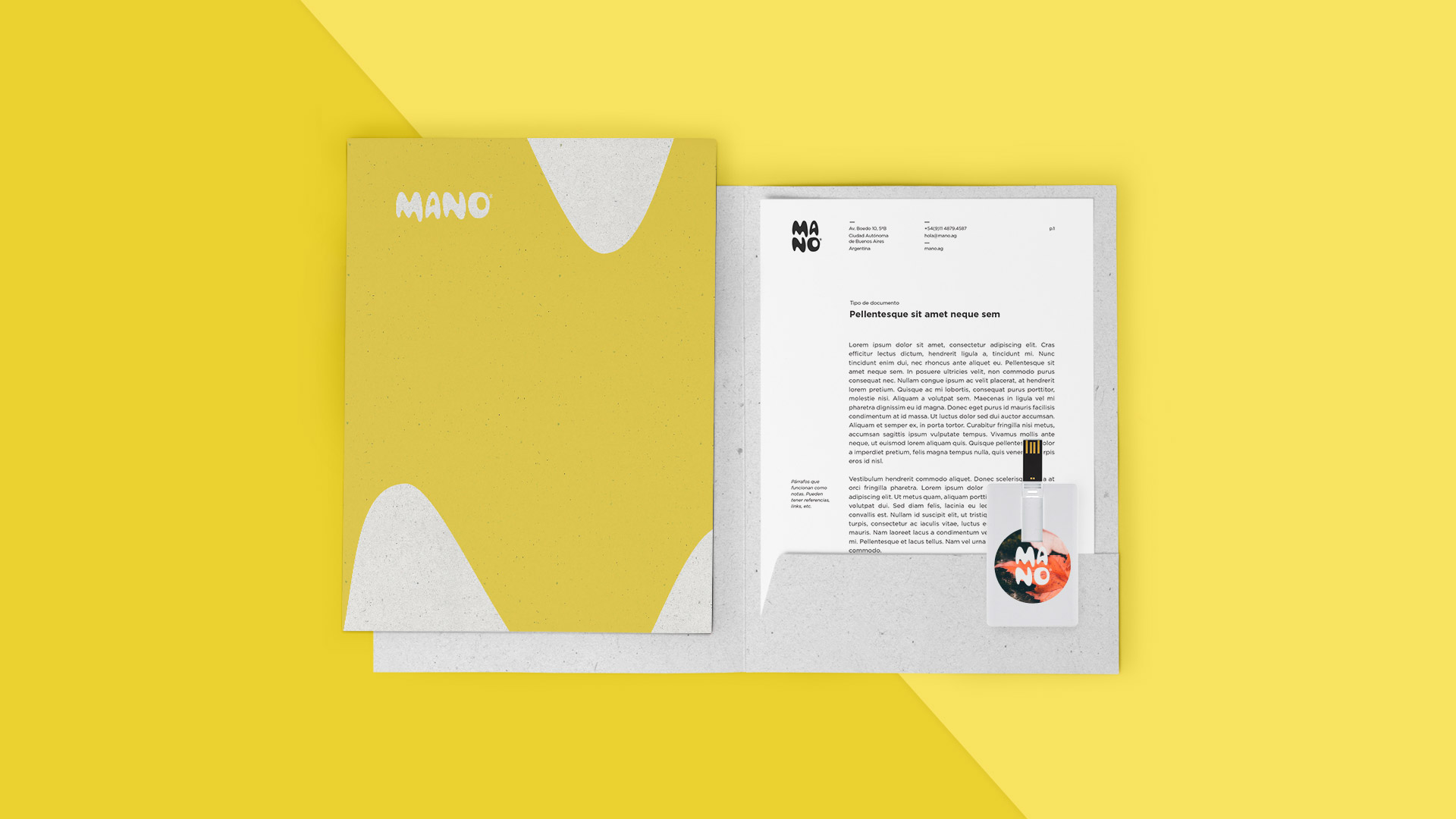
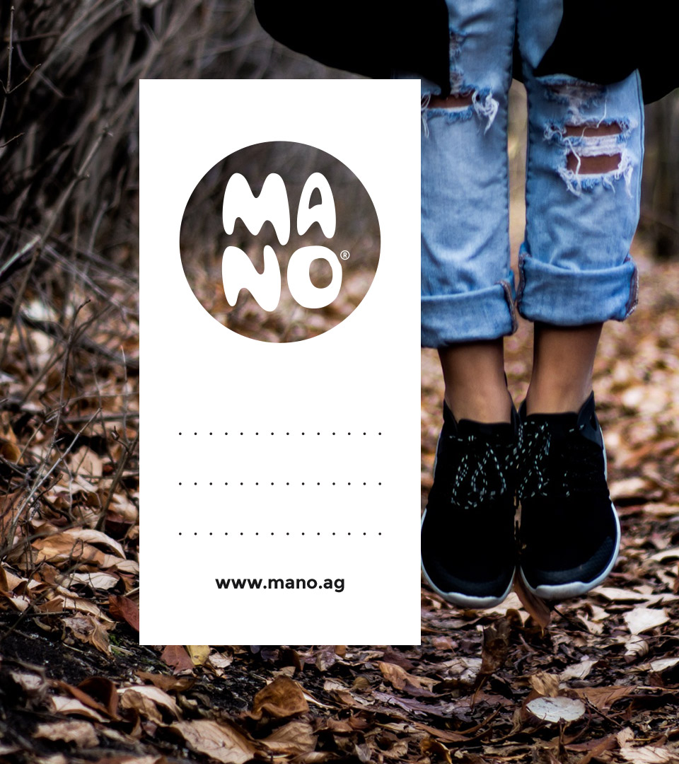
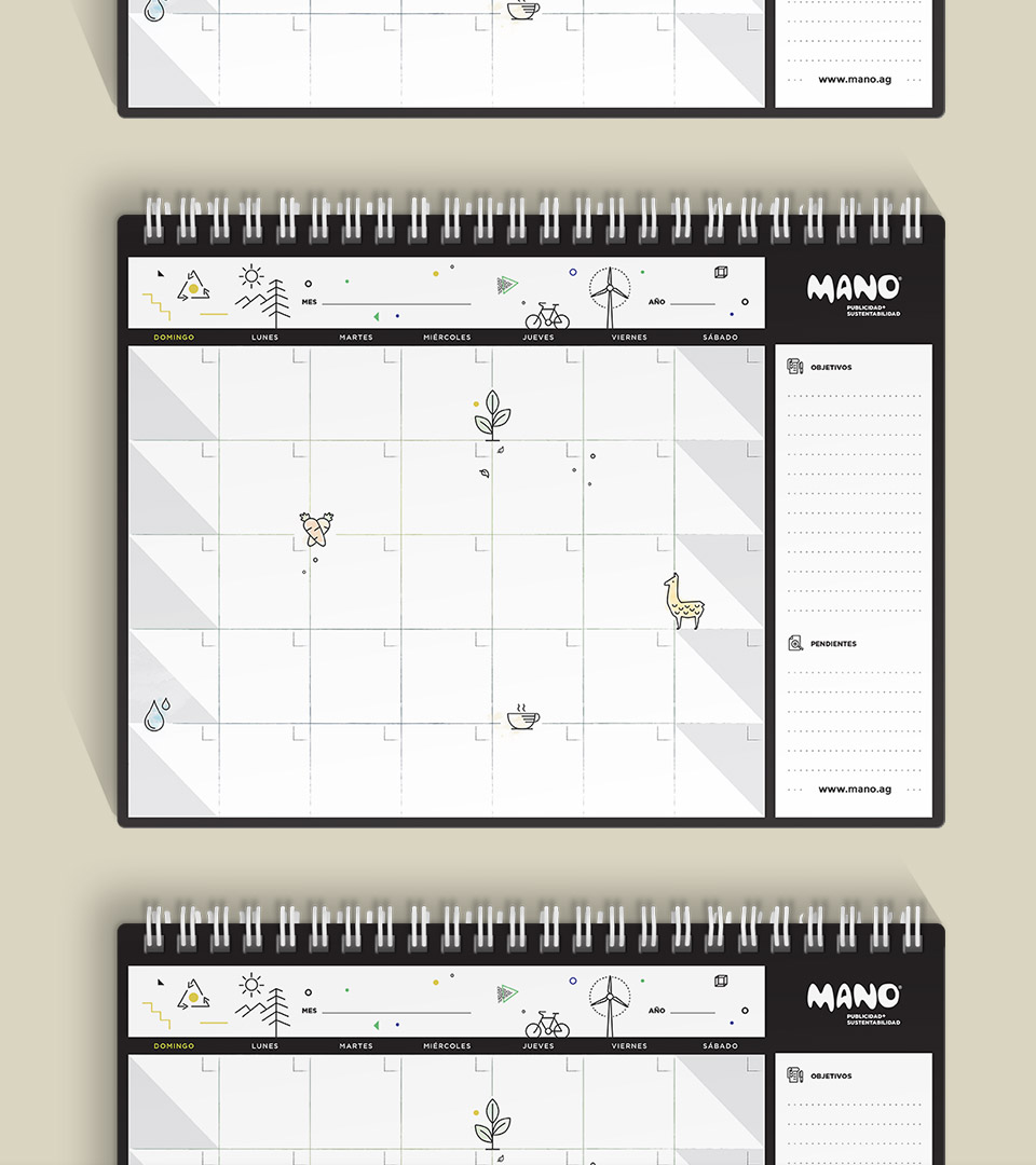
They asked us to redesign their logo, which we did by keeping their relaxed essence and improving legibility. Along with the logo, we created a new icon system and selected an image style to match the tone of the brand. Finally, we created a brand guide, with instructions on how to combine these elements.

Legibility

To improve legibility we focused on the shape of MANO. In smaller sizes of the original logo, the typography would look smudged and become hard to read.

To correct that, we focused on making each character more recognizable: we added the counters of the letters A and O, and increased the size of the counter shapes of the letters M, A and N. Adding more white space and removing the world icon from the letter O, we were able to balance the weights and spacing in the logo.

Professionalism and sustainability

Having renewed the logo and brand, we designed the corporate stationery, including new personal cards, planners and envelopes. Additionally, we created ecological bags, stickers, labels and wrapping paper.

We took into account printing techniques and suppliers that complement the professional image of Mano® with a handmade and sustainable imprint.