Tica Packaging

Packaging design and label system expansion for natural cosmetics

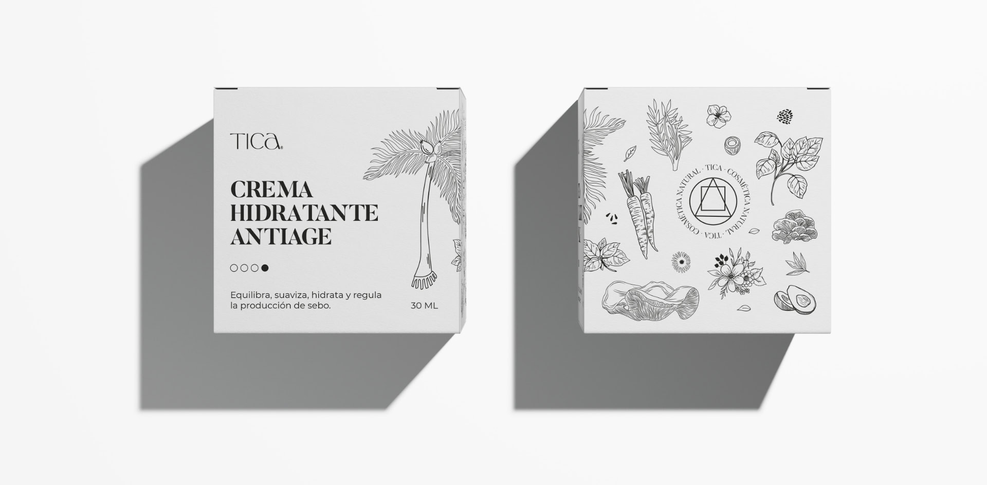
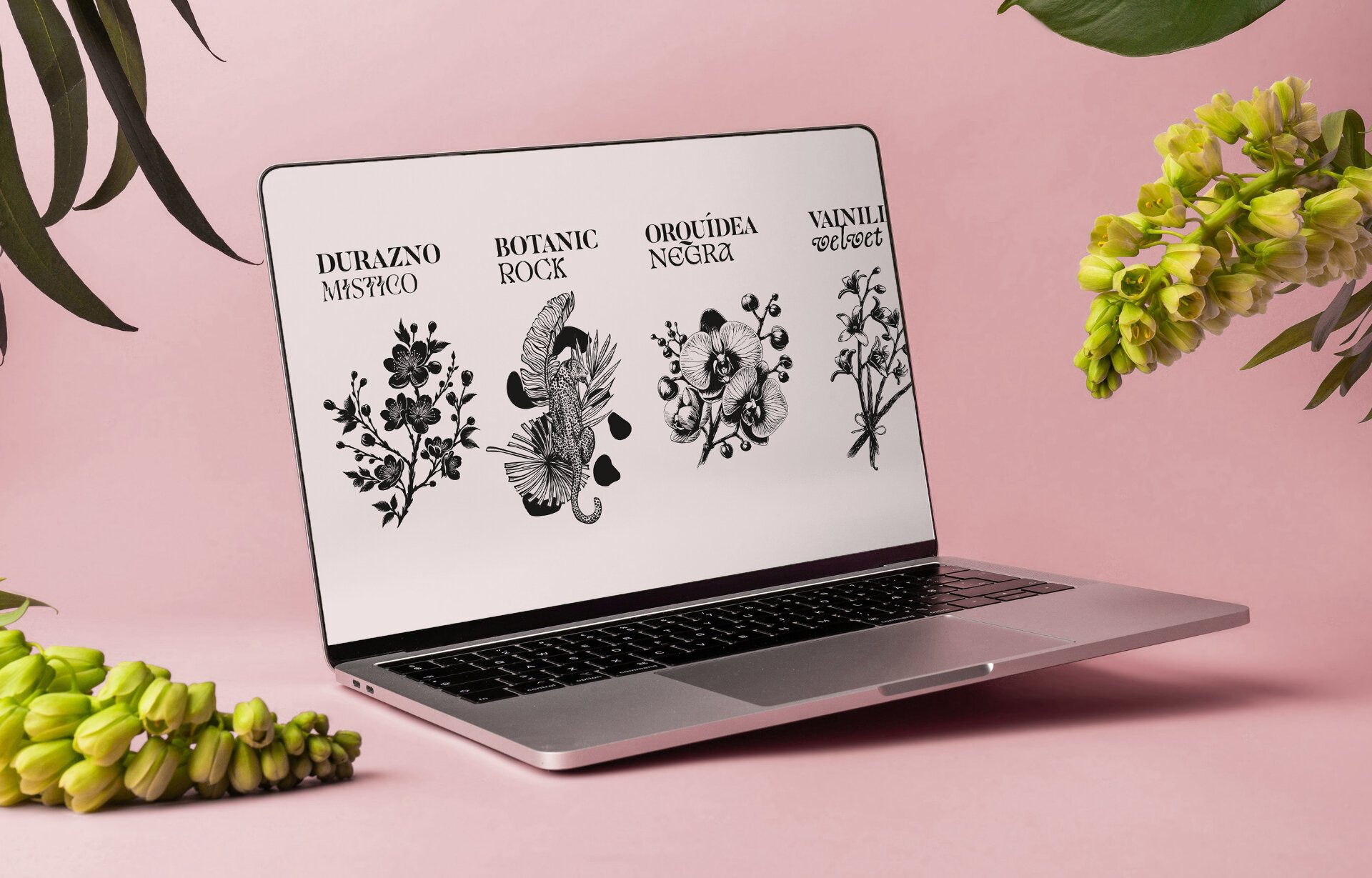
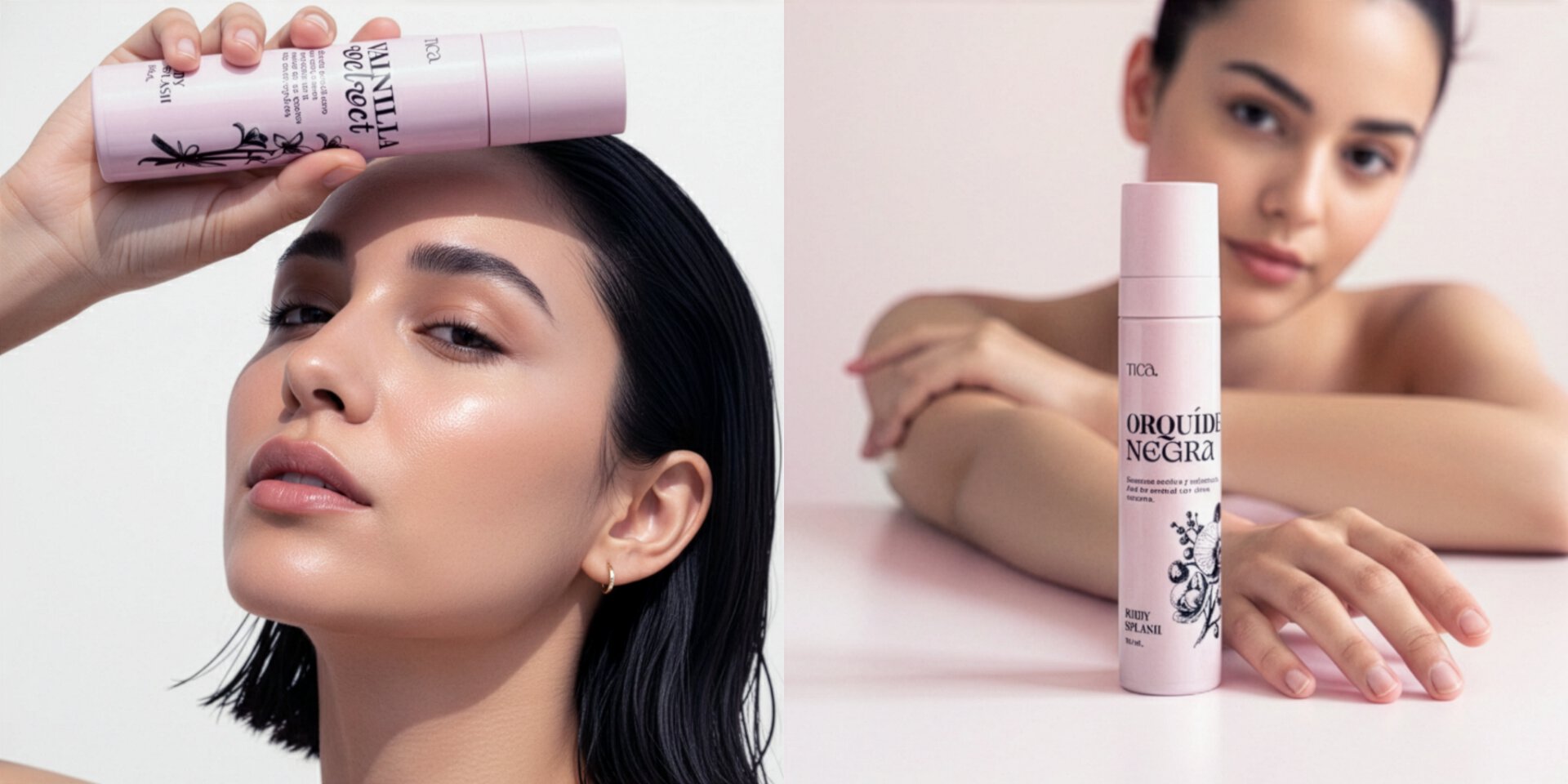
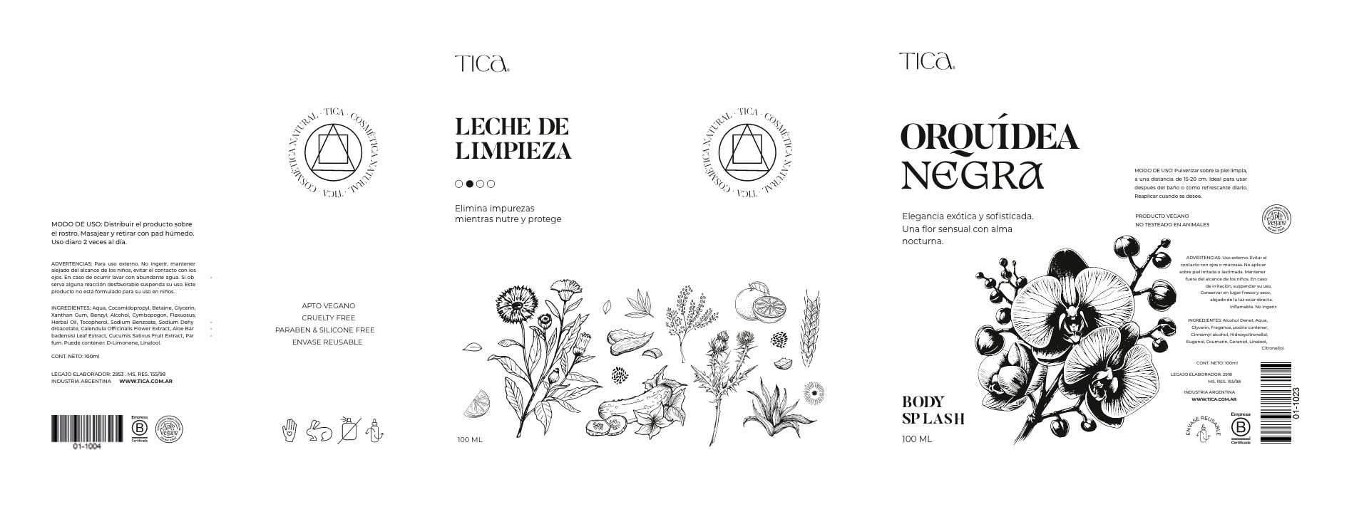
TICA is a cosmetics brand focused on natural botanical extracts and conscious care. We were entrusted with the challenge of designing the packaging for their entire product family and the labels for their new line of body splashes. Facing the technical constraint of black-and-white printing, we leaned into the power of botanical illustration and typographic contrast. We developed a visual system based on synthesis and detail, achieving a sophisticated and timeless product identity centered entirely on the purity of its natural active ingredients.

A System Based on Botanical Families

For the boxes of the main skincare line—Serums, Oils, Creams, and Cleansers—we proposed an organization based on a shared graphic language. Instead of designing isolated pieces for each product, we created a system of botanical illustrations grouped by category, where each plant composition represents the extracts found across that entire product family.

By sharing this graphic universe, we optimized production while consolidating the brand’s shelf presence. This system allows the products to be perceived as part of a cohesive ecosystem, facilitating the addition of new items without breaking the established visual unity.

Body Splash: Typography & Character

With the launch of the body splashes, the challenge was to integrate these new products into the existing visual system while giving them their own personality. Given the evocative names of the scents—such as Mystic Peach or Black Orchid—we decided to introduce more expressive typographic variables.

We maintained coherence through the illustrations but played with the design of the names to reflect the character of each fragrance. The result is a line that lives perfectly alongside the skincare products but stands out for its freshness and playful identity, achieving a natural transition between treatment cosmetics and daily fragrance.

Related projects