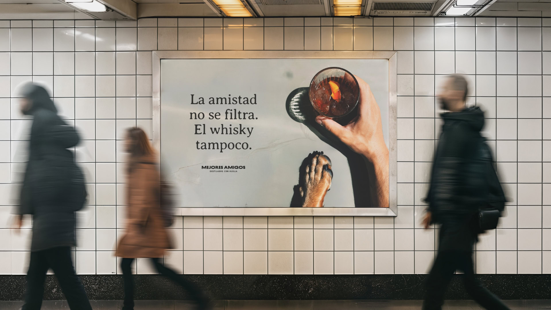
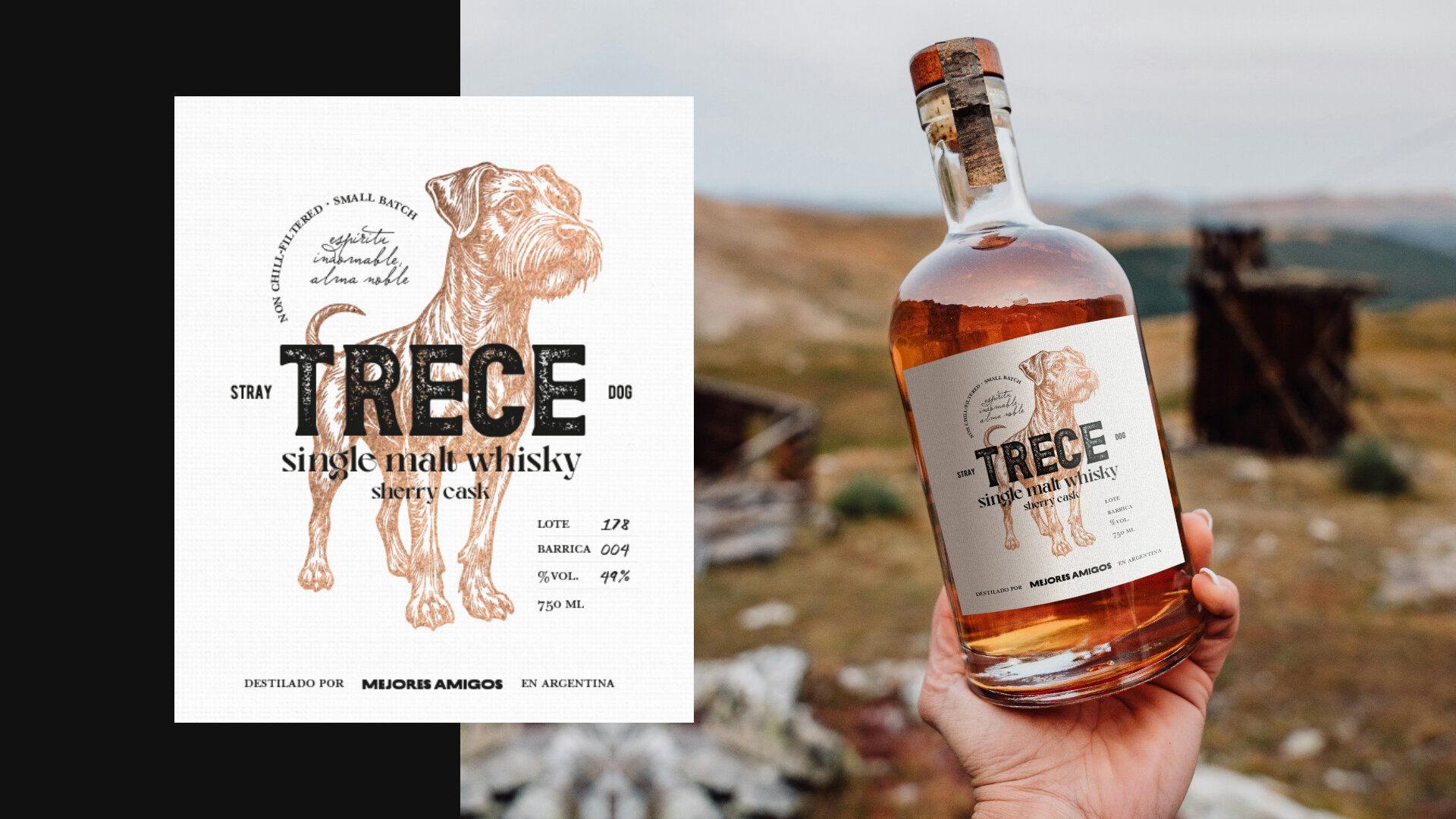
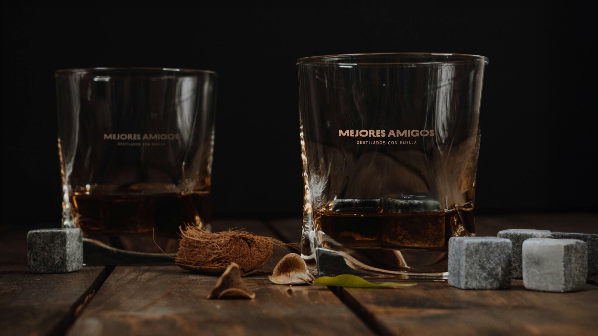
Mejores Amigos

Strategic consulting, branding, and label system for a distillery that leaves its mark

Miguel and Maximiliano approached us with a challenge: to professionalize the image of their spirits, Trece and Egle. What began as a request for labels evolved into a comprehensive intervention. Detecting divergent visions and an informal structure, we proposed a Brand and Communication Strategy Consulting phase. We acted as partners and facilitators to unify their goals and transform doubts into brand decisions, building a roadmap that ensured the subsequent design was rooted in real business needs.

Consulting: Aligning Vision and Business

We began with a deep discovery phase to identify the distillery’s short, medium, and long-term needs. We developed a report based on five strategic pillars—Digital Presence, Communication, Product, Sales, and Marketing—focused on elevating the brand’s market presence. Our goal wasn’t to intervene in the company’s internal structure, but to chart a clear action plan so that every message, channel, and product remained consistent with the partners’ objectives. From managing channels like WhatsApp Business to projecting an e-commerce platform, this stage ensured that the visual design had strategic substance and optimized the distillery’s communication resources.

We acted as strategic partners—and at times, as facilitators—to unify the founders’ vision and transform their doubts into definitive brand decisions.

From Essence to System

We started with a powerful manifesto reflecting on unconditional loyalty—both human and animal—to structure the project’s pillars. This foundation allowed us to define a brand personality that is loyal, expert, and authentic: a premium proposal positioned by its artisanal rigor while remaining accessible and human in its message.

Through a creative briefing stage, we translated the partners’ imagery—ranging from European post-war bar aesthetics to a search for “rustic, informal luxury”—into a meaningful visual system. We understood that we weren’t designing for mass consumption, but for “explorers of fine drinking”: an audience that values the story and the soul behind every label. This conceptual clarity guided every aesthetic decision, ensuring the brand had a clear purpose before the first sketch was drawn.

Branding: Friendship in All Its Forms

We developed the visual identity under the premise that bonds are not static. The logo uses variations in character width to reflect the ups and downs, the distance, and the closeness that define genuine relationships. Its visual weight acts as a hallmark, representing the lasting imprints that friendship leaves on every person. To complete the system, we added the claim: “Destilados con huella” (Spirits that leave a mark)—a synthesis that grants character and meaning to the umbrella brand.

Label System

We designed a cohesive system where each spirit maintains its unique identity—inspired by the companion animals they are named after—under a common visual umbrella. Coherence is achieved through color treatment and a consistent typographic structure that facilitates product family recognition. The system was built for scalability, making room for future spirits and tributes without compromising the mother brand’s visual integrity.

The distinction lies in the variables that reinforce each bottle’s personality: while for Trece Whisky we captured the free spirit and loyalty of a stray dog through street-style typography and a stamp effect, for Egle Gin we opted for an elegant, stylized stroke representing the precision and nobility of the peregrine falcon.

To elevate perceived value, we planned for the use of foil stamping (copper for Trece and metallic blue for Egle). This decision was conceived as a scalable resource: the design allows for an initial standard printing that can evolve into premium finishes in future runs without needing a redesign. The result is a system that not only stands out on the shelf but invites the consumer to discover the story behind every spirit.

Related projects